The feedback we were given from our audience on the first rough cut was that it was overall extremely good but needed more locations, such as creating a more dystopia style trailer, for instance demolishing buildings in London. We then went back and shot more footage in London which was then used on a week of intense editing to create the final cut...

Sunday, 10 April 2011
Wednesday, 30 March 2011

Sunday, 27 March 2011


Friday, 25 March 2011

Thursday, 24 March 2011
Completed Posters
This is my completed poster made with Photoshop after spending several hours matte painting. The effect I went for was 'The Book of Eli' meets 'Cloverfield' with the carnage of the destroyed road and piles of rubble signifying 'The Book of Eli, whilst destroying an iconic building, in this case 'Big Ben' to resemble 'Cloverfield'.
UK Poster

+ One Foreign Poster

UK Poster

+ One Foreign Poster


Tuesday, 14 December 2010

Research on Posters
Whilst in the process of creating my own film poster, I looked at several real production posters to help meet the conventions. The first poster campaign I looked at ‘I am Legend’ and as we were making a postmodern dystopia themed text, we could draw possible ideas from it. What we wanted to create was an apocalyptic style poster, where our protagonist would be walking through the deserted streets of London, etc…

Therefore, analysing the ‘I am Legend’ posters one thing you instantly notice is how cohesive the four posters our shown below. The logo always at the middle bottom and actor ‘Will Smith’ name in bold capitals remains at the top. Also, the slogan in black always remains at the bottom of the actor name as well as the omnipresent production name/companies always at the bottom of every poster. I also liked the colour scheme and choice of setting they have chosen, for example the consistent dark orange and yellow with the black shadow around the edges enhances the mystery within the poster. The director chose to you use the destroyed Brooklyn Bridge because it is iconic. When viewers see the devastation, questions are immediately raised as to how that had happened and gets people into cinemas. Lastly, the same image of Will Smith features on each poster which makes the poster consistent, so viewers can easily identify the movie.

Furthermore, the second marketing strategy ‘I am Legend’ had was to create several foreign posters which would gain exposure from countries across the world. They uniquely chose to destroy iconic buildings across various countries, for example the destroyed London Bridge in England and the Eiffel Tower in France shown above. This shows that ‘I am Legend’ is marketing to a wide range of audiences and not just America through its unique strategy. The consistency continues with the same dark orange shown in the previous posters. Whereas, the production logos kept always to the left and name of actor and title kept also depending on the nature of the image. This was an idea I immediately wanted to replicate.
Cloverfield:

The Cloverfield marketing campaign received brilliantly reviews, as the poster and teaser trailer alone played an influential part getting people into cinemas. The teaser ended with the iconic head of the statue of liberty crashing into the streets of New York. The trailer simply ended with date the film was coming out without the mention of the name of the film. This created an immediate buzz across the internet as viewers were wondering, what it was they just watched? Nonetheless, the poster answered many wuestions with the statyue of liberty missing it’s head with skyline of New York with smoke descending at a distance. The same date appeared but this time with the name of the film with the heading at the top, ‘Something has Found Us’. This then made it evident to me that it was important that my teaser trailer was cohesive with my poster.

The Book of Eli

I looked at various posters, but the last poster that stood out to me was ‘The Book of Eli’ foreign poster. I feel the poster works perfectly conveying an apocalyptic theme and what we were setting out to do. We see Denzel Washington’s character looking vulnerable across a destroyed city, filled with destroyed cars, roads covered in debris and dilipdated buildings in the distance. This gave me an idea to create my own version with my character centred overlooking a destroyed London skyline. I also noticed the actors name and title were all in Japanese and the company names and logos always remain at the bottom even on foreign posters.
Poster & Selected Poster Research

POSTER RESEARCH
Furthermore I also conducted extensive research into posters as I knew that as one of my ancillary texts I would have to create a poster. Below is a section of my poster analysis; however my full analysis is combined with my teaser trailer research which is the first post on our blog named ‘Extensive Research 1 - 50 Teaser Trailer's – PowerPoint’.
Inception Poster
I also analysed the ‘Inception’ poster. The first thing that I noticed was that it was coherent with the website and the teaser trailer. This is because the title of the film is in the same font and font colour and the colours used are dark and de-saturated. As a result this has shown me the necessity and importance in making sure that the ancillary texts that I create are also coherent.
Also the rule of thirds is used in the poster; as a result this makes the poster very simple but effective. Therefore the poster does not overload the viewer too much as this would draw the reader away. This has shown me now the importance and some techniques that I need to use to create a poster that is fit for purpose and as effective as possible.

2012 Poster
Also the poster for ‘2012’ is coherent with the teaser trailer and the website as the same colour scheme is used and the same image is used. This has shown me the importance of making all of the ancillary texts that I create coherent.
In addition at the bottom of the ‘2012’ poster there is a caption line, ‘We were warned,’ as a result this slogan makes the poster a lot easier to remember which is what the aim of the poster is. As a result I will make sure that I will include a slogan.

The Social Network Poster
Also the poster is very interesting and effective. This is because the poster is simple but still informs the audience what the film is about. This is because as well as the name of the film telling the films plot the images that make up the word ‘Social’ are of people socialising. As a result this shows the audience that the film will be about this and therefore this will definitely attract their target audience of teenagers and young adults. As a result this has shown me that I should use play on mechanisms to make the audience think about the poster but still make it simple like this poster.

The Island Poster
Also the poster of the film is very effective. I think this because the image is of the two characters running away. This gives the interpretation that they are escaping and therefore this makes the audience think that the film will be action packed and interesting. This has shown me that through the image and what the image shows it can entice the audience to watch the film if the image can be interpreted in different ways. As a result I will make sure that the image in my poster is interesting and entices the audience to watch the film.
Finally another aspect that I like about the poster was how the slogan is simple but is very informative. This is because by the phrase ‘Plan Your Escape’ it gives the impression that they are on the run and as this is another great way that will entice the audience to watch the film. This has shown me the slogan that I use will have to entice my target audience to watch the film by the wording and the meaning of the phrase.

Avatar Poster
The poster for the blockbuster film ‘Avatar’ was very effective. I think this because the poster shows the different from the human and the ‘Avatar’ on the sides of the poster and then the location in the middle. As a result as this is unusual and unique the audience can see the difference between the normal world and the world called Pandora. As a result they will be curious and enticed to watch the film and therefore the poster will be doing its job. Also bright colours are used so the poster is eye catching and therefore more people will see the poster and this will increase the viewers for the film. This has shown me I should make the poster eye-catching and unique to maximise the effectiveness of the poster.
Research & Magazine Cover
Part of the unit was to analyse and create our very own magazine cover. We looked at a wide range of magazine covers from various film industry magazine companies. Nonetheless, I decided I would like to re-create a ‘Total Film’ & ‘Little White Lies’ cover because I thought they were two uniquely crafted covers. They would allow me to convey my own ideas and present a chance to show my Adobe Photoshop skills.
Total Film...

The first magazine cover from ‘Total Film’ I looked at was the Ironman issue. This was a cleverly designed poster with very clear meaning. For example, (Number 1) the price, website details, Issue date and number are always at the top right of the ‘M’ on the cover. It is essential to show consistency throughout the cover, otherwise it will not look convincing. (Number 2) the ‘Total Film’ logo stays the same throughout every issue, so this was key to creating a distinct look. (Number 3) the colour scheme is always consistent in every copy. For example the clear bold, golden text of the cover line ‘Ironman 2’ is generated from the gold helmet of Ironman, whereas the flash of light blue on the hand is complemented by a dark blue background. On (Number 4) we notice how the plugs on the left hand side compliment the main story. For instance, the theme for this issue is sci-fi, the magazine also talks about stories on Batman’s Dark Knight ‘as well as the teaser ‘More Marvels’ which uncovers other superhero’s such as Thor & Captain America. Lastly, (Number 5) the barcode is ever-present on the bottom right corner, with the publishing company logo ‘future’.

The Spirit issue was the cover that I felt was most suitable to our particular film, for instance the use of red tie with the dark shadows in essence of film noir. I took into account (Number 1) the puff on the top of the cover ‘Free Posters’ in bold white capitals behind a red background, mainly used as a unique selling point. Furthermore, the second strategy Total Film used to sell copies was (Number 2) a teaser, ‘World Exclusive’ – the word ‘exclusive’ add an importance; that this is the only magazine with that particular story. I was also impressed with (Number 4) the chosen font, which is fit for purpose. The movie is inspired by the original comic book story to which the red and white bold, retro font matches.

Little White Lies...

Whilst the ‘Inception’ issue was my favourite individual cover, the concept behind ‘Little White Lies’ I was particularly enthralled with. The design behind the cover was extremely stylized and individualistic; the image was always a close-up head shot of a particular person/character transformed into a comic-style image. The cover is always very eye-catching with either a colourful background or image of the character. There is relatively/if any text around the outside with only the title of the movie, whereas the logo always stays the same on top/middle as a white circle with the barcode and trademark logo.
Draft 1 of Covers...

Total Film Front & Back Covers

Little White Lies
Research & Magazine Cover

In addition I have conducted extensive research into several Empire Magazines, I did this in order to give me a better understanding which help me in the long term, when I create my magazine cover as one of my ancillary texts.

The Inception Empire Magazine Cover has shown me the typical conventions of a magazine cover, for instance a strapline, website and barcode. As a result this has shown me that I must include this in order for my ancillary text to look real, professional and realistic.
Also I found out that Empire commonly use puffs, but in shapes. As a result this makes the puff stand out more and therefore I will make sure that I include a puff on my front cover, also this will help me create my empire front cover.
Furthermore I can see the effect a teaser can have on the magazine. This has a positive impact on the magazine as this entices a lot of people to buy the magazine. As this is the aim of a magazine and the aim of the magazine that I will be creating I will make sure I add an enticing teaser, such as The Dark Knight Returns, as this was a well received film.
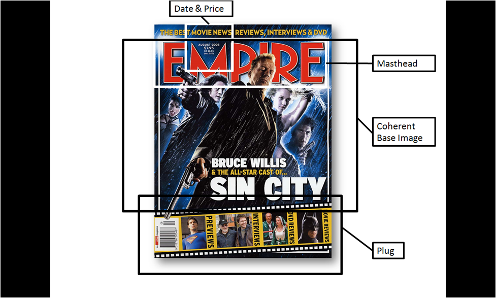
From this Empire Magazine Cover I have found out the importance of the need for the base image being coherent. This can be clearly seen in this cover as the film noir effect is clearly visible. As a result this makes all of the films ancillary texts look more realistic and informs their target audience.
Also I saw the traditional conventions of an Empire Magazine, the logo (masthead) and the date and price in the letter M. As a result this has shown me that I have to also include these conventions in my Empire Magazine Cover to make it look professional and realistic.
Furthermore as all Empire Magazine Covers have plugs for my cover I have to make sure I have a plug, this cover has shown me a great idea that I can use for my magazine cover and therefore helped me when I create my ancillary text.

Firstly like the other magazine covers that I have seen I can clearly see the repetitive parts on the Empire Magazine, for instance the Empire website, barcode, teaser and plugs. As a result this has shown me some of the conventions that I have to include on the cover in order to make my Empire Cover look professional and coherent.
Furthermore I noticed how the usual + sign when the additional information is stated is twisted to an X. As a result as this is not usual this makes the Empire Cover look more colloquial which is what the Joker is all about. As a result this makes the cover coherent with the other aspects of the film and has shown me that I should try to use the conventions of the cover to my film genre and film.
This cover was the best Empire Magazine Cover I have seen from all of my extensive research.

From this magazine cover I can see that the masthead has not changed. As a result this has shown me that I cannot change the font of the Empire Logo as this will not look like a professional empire cover, however I do know that I can change the colour of the logo which will help me considerably to make my front cover coherent with my other ancillary texts and teaser trailer itself.
Also from this front cover I can see that the image is coherent with the other aspects of this film, this is because the image is of Wolverine, which is obviously the face of X-men. Therefore this has shown me that I have to make sure that my magazine is coherent with my teaser trailer and poster.

Furthermore from this Empire Magazine front cover this has reiterated to me the conventions of an Empire magazine, for instance I can clearly see that the masthead, strapline, Empire website, + sign, date and price and puffs & plugs are always extremely similar every issue. As a result this has shown me that the magazine cover that I create has to include all of these aspects because if it does not then this will result in my magazine not looking professional and realistic and therefore this will have a negative impact on my magazine as this will draw many people away, therefore I will make sure that I include all of these Empire magazine conventions.

The final Empire magazine that I looked at was for the film Expendables. This magazine cover showed me the importance of the base image. This is because this instantly entices the audience to look at the magazine over, which is the aim of the image and therefore this has shown me that I include a base image that is striking to the audience and therefore entices people to buy the magazine.
Furthermore this magazine cover, similar to the Sin City cover, includes a unique plug. This is because unlike the usual plug, just plain text, there is a comic strip template used that then includes the information. This is an excellent and effective addition and has enticed me to use the same template as I think that this will be extremely helpful and coherent with my Empire front cover as our film is similar to a Marvel comic.
In conclusion from this extensive research I have found out a lot of invaluable information which has helped me considerably to make an Empire Magazine Cover that looks professional, coherent and realistic.
Rough Cut
This is our a finished Rough Cut. We will then ask for feedback which will contribute to our Finished Teaser Trailer.
*PLEASE WATCH IN 720p HD*
*PLEASE WATCH IN 720p HD*
Music


Jordan Simpson;
To create my section of our music soundtrack I used Pro Scores. This was a brilliant music software tool which was very user-friendly, making it easy for users. The software featured over 300 template music files, such as percussions and epic orchestras. Below features the official track used on the teaser trailer entitled ‘Panic’.
I then used Adobe Audition 3.0 to lay out and edit the tracks to contribute towards the music score ‘Mind Heist OST’;

Mind Heist - Panic by distortedpicturesLTD
Amar Bram;
In order to create the music for our teaser trailer I used GarageBand. As this was commonly used I thought that this would a great piece of software to use as it was simple and user friendly. Furthermore as GarageBand is so popular it has a wide variety of musical instruments that the user can choose from and therefore this benefitted our production considerably as this allowed us to make the music that we wanted to. Some examples of the musical instruments that GarageBand has are a piano, drums and guitar.
However we created all of our music and decided on the best one, as a result the other soundtracks that we created we decided to add to the website so our viewers could enjoy the website, below is a sample of one of the soundtracks.
ONE SIMPLE IDEA by mindheist


Research Into Digital Film Marketing
Part of the module required us to make our very own film website. Therefore, to successfully create a realistic website it was important that we did our own research, on how actual films set out their websites and what conventions they used. Nonetheless, as one of our production companies were ‘Warner Bros’ I decided to analyse three websites from each of our main source texts, as we were going for a dystopia/postmodern inspired theme. The websites I analysed are as followed;
I am Legend;

Home Page: The first site I analysed was ‘I am Legend’ and the first thing you notice when entering the site is the trailer automatically playing to grasp the viewers’ attention. The site sticks to a three colour scheme of white, gold and black which is executed brilliantly. In terms of the information on the page, the audience is presented with the synopsis of the film, with the image of DVD above. In clear black and bold font reads ‘Own it on Blu-Ray’ which acts as a unique selling point. Furthermore, the image of the protagonist within the film (Will Smith) is also cohesive with the film main poster, which helps viewers to identify easily with the film.

Main Site: Once on the main site we are presented with same image of Will Smith (wondering cautiously through a deserted street). The colour scheme remains black and gold, with the same ‘I am Legend’ logo at the top of the page. The names of people involved in the production of the film always remain at the bottom of the page whilst browsing. Also at the bottom of the page, we see the production logos of the companies involved creating the film.

A page that viewers can navigate to is the ‘Photo Gallery’; this usually contains images of the actors in role, with various action shots and occasional directors on set giving guidance to actors.

My favourite page on the site was ‘Downloads’, this was where viewers had the opportunity to download; screensavers, avatars, posters and wallpapers. I would consider this page when creating our own website as this would give me a chance to include our: magazine covers as well as posters.

A unique page within the website was the comic novel. Which is where the original idea for ‘I am Legend’ came from until developing onto screens. Viewers could read this section to gain a better understanding of the film. This then gave me an idea to include our own photo storyboard novel and/or drawn storyboard.
Inception:

The second film website I decided to analyse was our main source text ‘Inception’, which in terms of creativity was my favourite. I noticed that Warner Bros always kept the production names and logos always at the bottom of each of their film websites. Also, there is an opportunity for viewers to stay connected with the Facebook ‘like’ button just at the bottom of the page which is a viral marketing technique to help gain exposure for the film. Similar to ‘I am Legend’ the puff at the top of the page offers DVD options for a chance to buy. In addition, I came under the realisation that the main point of a film website is try and get viewers to buy the DVD emphasised by the bold capitals of ‘BUY IT NOW’ spread throughout the main page above.

A page on every film website site is ‘About the Film’ section. This includes a synopsis and plot outline for readers, as well as information on the cast and filmmakers. Inception kept the same colour scheme throughout with use of bold red text of the title ‘Inception’ against the back drop of the dark blue.

Another option for viewers to navigate to is the ‘Soundtrack’ page from composer Hans Zimmer. The award-winning soundtrack is so iconic that viewers can easily access the page to listen to the full featured OST. At the bottom right in bold capitals expresses the word, ‘Get the Soundtrack’, where people have the choice to download from iTunes or buy the cd, (I would also take this under consideration).
The Book of Eli:
Home Page: The last site I analysed was ‘The Book of Eli’ which out the three texts; tried to emphasise the most of buying of the DVD. What we notice below is that the main image of actor Denzel Washington uses dull and dark colours such as grey and black. This allows the website to use bright colours through its text; we notice the important information such as ‘Buy Now’ and ‘Own It’ is in bold red to emphasise the importance of buying the DVD. Furthermore, as well as the continuous production information at the bottom; the site includes an option for viewers to either ‘follow’ on Twitter or ‘become a fan’ on Facebook which shows that the site is choosing every opportunity to market the film.

The last page I decided to analyse to contribute to our own website was ‘The Making of’. This section showed viewers how they came to making the film and there drawn storyboards were soon developed into the actual film. This gave me an idea to include our very own tutorial of how we came to making the film.

Nonetheless, below contains my step outline including all the conventions I have analysed and how I would like our website to look;

1) Homepage when first on Website 2) Main Site
I am Legend;

Home Page: The first site I analysed was ‘I am Legend’ and the first thing you notice when entering the site is the trailer automatically playing to grasp the viewers’ attention. The site sticks to a three colour scheme of white, gold and black which is executed brilliantly. In terms of the information on the page, the audience is presented with the synopsis of the film, with the image of DVD above. In clear black and bold font reads ‘Own it on Blu-Ray’ which acts as a unique selling point. Furthermore, the image of the protagonist within the film (Will Smith) is also cohesive with the film main poster, which helps viewers to identify easily with the film.

Main Site: Once on the main site we are presented with same image of Will Smith (wondering cautiously through a deserted street). The colour scheme remains black and gold, with the same ‘I am Legend’ logo at the top of the page. The names of people involved in the production of the film always remain at the bottom of the page whilst browsing. Also at the bottom of the page, we see the production logos of the companies involved creating the film.

A page that viewers can navigate to is the ‘Photo Gallery’; this usually contains images of the actors in role, with various action shots and occasional directors on set giving guidance to actors.

My favourite page on the site was ‘Downloads’, this was where viewers had the opportunity to download; screensavers, avatars, posters and wallpapers. I would consider this page when creating our own website as this would give me a chance to include our: magazine covers as well as posters.

A unique page within the website was the comic novel. Which is where the original idea for ‘I am Legend’ came from until developing onto screens. Viewers could read this section to gain a better understanding of the film. This then gave me an idea to include our own photo storyboard novel and/or drawn storyboard.
Inception:
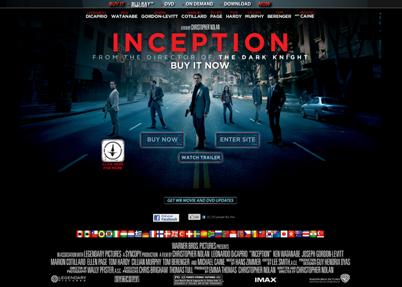
The second film website I decided to analyse was our main source text ‘Inception’, which in terms of creativity was my favourite. I noticed that Warner Bros always kept the production names and logos always at the bottom of each of their film websites. Also, there is an opportunity for viewers to stay connected with the Facebook ‘like’ button just at the bottom of the page which is a viral marketing technique to help gain exposure for the film. Similar to ‘I am Legend’ the puff at the top of the page offers DVD options for a chance to buy. In addition, I came under the realisation that the main point of a film website is try and get viewers to buy the DVD emphasised by the bold capitals of ‘BUY IT NOW’ spread throughout the main page above.

A page on every film website site is ‘About the Film’ section. This includes a synopsis and plot outline for readers, as well as information on the cast and filmmakers. Inception kept the same colour scheme throughout with use of bold red text of the title ‘Inception’ against the back drop of the dark blue.

Another option for viewers to navigate to is the ‘Soundtrack’ page from composer Hans Zimmer. The award-winning soundtrack is so iconic that viewers can easily access the page to listen to the full featured OST. At the bottom right in bold capitals expresses the word, ‘Get the Soundtrack’, where people have the choice to download from iTunes or buy the cd, (I would also take this under consideration).
The Book of Eli:
Home Page: The last site I analysed was ‘The Book of Eli’ which out the three texts; tried to emphasise the most of buying of the DVD. What we notice below is that the main image of actor Denzel Washington uses dull and dark colours such as grey and black. This allows the website to use bright colours through its text; we notice the important information such as ‘Buy Now’ and ‘Own It’ is in bold red to emphasise the importance of buying the DVD. Furthermore, as well as the continuous production information at the bottom; the site includes an option for viewers to either ‘follow’ on Twitter or ‘become a fan’ on Facebook which shows that the site is choosing every opportunity to market the film.

The last page I decided to analyse to contribute to our own website was ‘The Making of’. This section showed viewers how they came to making the film and there drawn storyboards were soon developed into the actual film. This gave me an idea to include our very own tutorial of how we came to making the film.

Nonetheless, below contains my step outline including all the conventions I have analysed and how I would like our website to look;

1) Homepage when first on Website 2) Main Site
Research Into Digital Film Marketing
In this section of my coursework I will be conducting research into the Digital Film Marketing. As I know that I will be designing a website as one of my ancillary texts I have decided that I should conduct some more research, my intial research can be seen in the very first post on this blog, ‘Extensive Research 1 - 50 Teaser Trailer's – PowerPoint’. As a website is a fantastic form of promotion I think that this will be great way to raise awareness of the teaser trailer that I am creating. As a result we are using aspects of these 9 teaser trailers and I have decided I will look and then analyze these websites, below are the films:
• Sin City – Frank Miller, Robert Rodriguez, Quentin Tarantino - 2005
• Maltese Falcon - John Huston - 1941
• District 9 - Neill Blomkamp - 2009
• Terminator 4 Salvation – Joseph McGinty Nichol - 2009
• 28 Days Later – Danny Boyle – 2002
• Fight Club – David Fincher - 1999
• Memento – Christopher Nolan - 2000
• The Matrix – Andy Wachowski & Lana Wachowski - 1999
• Inception - Christopher Nolan - 2010
I will now show screenshots of the homepage of all of the websites and then I will analyze them, also below are the conventions of the website that I have found out from the PowerPoint that I previously created, (Analyses of 50 teaser trailers, Websites and Posters).
• Opening Page Includes The Teaser Trailer
• ‘Enter’ Official Site
• Animations During The Loading Of The Site
• Enticing Image Matching The Genre Of The Film
• Reviews And Titles
• Navigation Bar At The Top Of The Page
• Tabs For Cast, Crew, Games, Videos, Photos, Download etc.
• Sound And Music
‘Sin City’ - http://www.sincity.aufdvd.de/

The first website I browsed was for the film ‘Sin City’. This is a screenshot for the Sin City Website; this film has a USA website and a Dutch website, this is the homepage for the Dutch website as I thought that this was a lot more effective and will help me more in the future. I thought that this website was very effectively because of many reasons. For instance the website was coherent, as this film has the genre of film noir by making the homepage of the website black and white it makes the film more understanding and gives the user more of an insight into the film.
Also there is an establishing wide shot of a city; as a result as the user will have more information of the film there is a greater chance they will want to watch the film and therefore I will now make sure that my website is also very informative.
In addition the website is also very interactive in many different ways. An example is how the user can play games on the website and in order for the user to visit further pages they have to hover their mouse over the buildings. As a result this makes the website look more enjoyable for the user and therefore as the user will like the website this will also tempt them to watch the film. As a result this will mean that the website is effective, this has shown me that I have to make the website as interactive as possible to tempt the user into watching the full film.
‘Maltese Falcon’ - http://www.symaltesefalcon.com/index2.asp

Furthermore I also tried to find and then analyse the Maltese Falcon website which was a film made in 1941, however although I found a Maltese Falcon website I believe that this is for a boat of the same name and not the film. As a result I have analysed this website thinking that it is the film website as I am not 100% sure.
This film has the genre of film noir. The location of this film is on a ship and this is outlined by the homepage of this ship. This was the very first factor of the website that I noticed and by this image it gave a lot of information to the audience. As a result the audience will have more of an insight into the film and therefore this has shown me how effective an image on the homepage can be.
In addition the colour scheme on this website is also very effective. The colours used are black and grey, stereotypical film noir colours. As a result this emphasizes the genre of the film and also makes the films ancillary texts more coherent. This has shown me that every aspect of the film has to be coherent and therefore I will now concentrate more about this.
Finally signifiers are used; this is because of the falcon at the top of the website and the ship. As a result this also gives more of an indication to the audience about the film, also as the sea is in a bright colour (sky blue) and the falcon also stands out (White on black) this emphasizes these factors and therefore by giving more of an insight of the film to the audience there is a greater chance that the audience will watch the film. This has shown me that signifiers are a great way to entice people to watch the full film and therefore I will make sure this is included in my website.
‘District 9’ - http://www.d-9.com/

The next website I looked and analyzed was for the film ‘District 9’. The first aspect of this website that I instantly noticed was how the opening page made the user make a choice; as a result this made the user more involved in the website which is the aim of the website. The option was for the user to say if they were ‘Human or ‘Non-Human.’ This has shown me that I have to make the website as involving as possible to make it more effective.
Furthermore the website for this film is also vey interactive, not only does the website start off with the user having to answer a question but there is a interactive map showing the location of ‘humans’ and ‘non-humans.’ This therefore makes the website more interesting and exciting and this has shown me that I should make my website as exciting as possible to increase effectiveness.
In addition the website is coherent with the film, for instance as the film is about a derelict town that is being taken over, the website outlines this. As a result this makes the user think that they know more about the film as they will understand the website more, therefore this will increase the chances that they will watch the film and as the website is a form of promotion this will mean that the website is highly effective.
‘Terminator 4 Salvation’ - http://terminatorsalvation.warnerbros.com/dvd/index2.html

The fourth website I looked at in detail was for the new ‘Terminator’ film. The aspect that I liked about this website was how it was enticing for people to continue to browse the website. This is because the website included interesting images and scenes of the film; also this made the website coherent. As the film is a sci-fi by making the website coherent and exciting this entices people that enjoy this genre to browse. As a result this has shown me that I have to make my website coherent and as unique as possible as then my website will attract people’s attention and hopefully they will want to visit the website.
In addition the website was also very interactive, for instance there are options that the user can click on such as ‘Terminate Yourself.’ As a result this entices the user to click on this and as the user will spend more time on the website there is a greater chance that the user likes the website and therefore will want to watch the film. This has shown me that I have to make my website interactive which will then result in people being enticed to watch the film.
Finally the website is also very ambiguous. By this I mean that the website is unclear and does not give too much away of the film. As a result this makes the user curious about the film and which will therefore entice them to watch the film which is the aim of the website. This has shown me that make an ambiguous website can also be very effective.
‘28 Days Later’ - http://www.foxsearchlight.com/28dayslater/

The next website that I analyzed and browsed was for the film, ‘28 Days Later’. The aspect that I liked about this website was how the colour red was emphasized throughout the website. As a result as the colour red has connotations of danger this indicates to the user that the film will be a horror. This has shown me the importance of the colour scheme of my website and therefore I will definitely think more about the connotations of colours depending on my genre.
In addition on this website the reviews from the website were emphasized, an example of this is how the review from the Daily Mail ‘Scary As Hell’ was at the top of the homepage. As a result this will entice people to watch on as the reviews are excellent and this has shown me that this is a very effective tool that can increase the amount of viewers.
Finally the website homepage was simple but still very effective. I think this because on the left half of the homepage there is the title and then on the right there are two phrases but then the rest is blank and therefore the user can only see the background. This can be a negative but I think that for this particular website it was very effective because the colour scheme is emphasizing the death and danger in the film. As this is a pulling point of the film this entices people to watch the film. This has shown me that creating a website that is simple is still effective and the colour scheme of a website is pivotal in the effectiveness of the website.
Fight Club - www.welcometofc.com

The aspect of this website that I liked was how the two actors were emphasized. As they are both extremely famous and well known, Brad Pitt and Edward Norton, this will entice people to want to watch the film. This is because as they will know the actors they will automatically think the film is good and therefore want to watch it. This has shown me that I have to create a website that will entice people to want to watch the film, however as I will not have celebrities in my film it will be a little bit harder.
In addition the colour scheme of the website is very dark and there is an emphasis of darkness through the de-saturated colour used. As the colour scheme of the website represents that the film will be sinister from the outset if the user wants to watch this type of film they will instantly think of watching this film. As a result this has shown me that I have to think of the colour scheme in my website and create meaning through it like the ‘Fight Club’ website.
Finally a negative of this website is that in order for the user to access extra information they have to loin via a Facebook account. This is a negative because not everybody has a Facebook page; however the positive aspect is that as most people do they will be tempted to log in as they will be curious to what the added extras are. As a result this will mean that the website will be working effectively.
Memento - http://www.otnemem.com/

The next website that I browsed was for the film ‘Memento’. The first thing that I noticed was how the URL of the website was back to front. As a result this meant that this was coherent with the film as the film is also back to front in many different ways. As a result this means when the user goes onto the website they will understand the website a lot more and if a user comes across the website before watching the film they will be curious and therefore they will watch the film. This has shown me that I have to create a website that entices the user to want to watch the film.
Also the website is interactive and therefore enjoyable for the user. This is because the user can only progress onto the website by having to click on the key words in the newspaper cuttings. This makes the user spend more time onto the website which is a positive; however a negative is how it can be complex for some people which can draw people away. As a result this has shown me that I have to create a website that is interactive but simple at the same time.
Finally a negative of the website was how in order for the user to continue to visit the website they must temporarily allow pop-ups. This would be okay for most people but if people have very good anti-virus software they will not have the chance to continue to visit the website. As a result this will draw the user away which is a major negative of the website. This has shown me that my website has to be visible to everybody and therefore I have to make sure that the website is simple and not too advanced.
The Matrix – N/A
‘The Matrix’ film that was released in 1999 currently does not have a website. Apparently according to my research it did have a website but it was recently disabled as the film was released 11 years ago and it did not attract a vast amount of visitors.
Inception - http://inceptionmovie.warnerbros.com/

The ‘Inception’ website has many aspects which I will consider using in my website. Firstly the website is coherent with all of the other texts (film, teaser trailer and posters). As a result when the audience visits the website they will have more of an insight and understand the website more. As a result this will mean that the audience will like the website and most likely be tempted to watch the film, which is the aim of a promotional website. I will now make sure that my website is coherent with all of the other texts.
In addition the website includes pull out reviews. This is a great way to entice the user to watch the film as they will realize that the film is excellent as this is what the reviews state. As a result this will mean that the website will be effective and working successfully. This has shown me that a great way to increase the amount of people that watch the teaser trailer, which is the aim of the website, is to include positive reviews.
Finally the website also emphasizes Leonardo DiCaprio. As he is a famous actor this is a great way to increase the amount of viewers, as his fans will definitely want to watch the film. As a result this has shown me that I must use my strengths to maximum effectiveness, however as we obviously do not have a famous actor that has the same caliber as DiCaprio we must emphasize something else that our target audience will like.
In conclusion from this research that I conducted on the focus teaser trailers I found out and learnt a lot of new information. The inclusion of additional pages on websites, such as a games section and reviews, is a great example of media convergence and synergy. This is when different sections of media join to work together, as a result this increases the probability of success as there should be something for everyone, as a result as this is a great way to entice more people to visit your website this has enticed me to try to include media converge and synergy in our film website that we create. As a result for the website that I create for my teaser trailer this will definitely help me and therefore I will look back at this analysis and consider some of these aspects that other websites have used as there teaser trailers will be similar to ours.
Subscribe to:
Comments (Atom)