
I am Legend;

Home Page: The first site I analysed was ‘I am Legend’ and the first thing you notice when entering the site is the trailer automatically playing to grasp the viewers’ attention. The site sticks to a three colour scheme of white, gold and black which is executed brilliantly. In terms of the information on the page, the audience is presented with the synopsis of the film, with the image of DVD above. In clear black and bold font reads ‘Own it on Blu-Ray’ which acts as a unique selling point. Furthermore, the image of the protagonist within the film (Will Smith) is also cohesive with the film main poster, which helps viewers to identify easily with the film.

Main Site: Once on the main site we are presented with same image of Will Smith (wondering cautiously through a deserted street). The colour scheme remains black and gold, with the same ‘I am Legend’ logo at the top of the page. The names of people involved in the production of the film always remain at the bottom of the page whilst browsing. Also at the bottom of the page, we see the production logos of the companies involved creating the film.

A page that viewers can navigate to is the ‘Photo Gallery’; this usually contains images of the actors in role, with various action shots and occasional directors on set giving guidance to actors.

My favourite page on the site was ‘Downloads’, this was where viewers had the opportunity to download; screensavers, avatars, posters and wallpapers. I would consider this page when creating our own website as this would give me a chance to include our: magazine covers as well as posters.

A unique page within the website was the comic novel. Which is where the original idea for ‘I am Legend’ came from until developing onto screens. Viewers could read this section to gain a better understanding of the film. This then gave me an idea to include our own photo storyboard novel and/or drawn storyboard.
Inception:
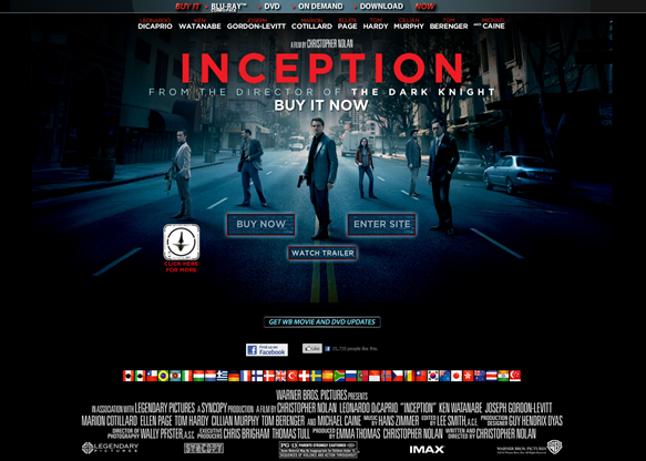
The second film website I decided to analyse was our main source text ‘Inception’, which in terms of creativity was my favourite. I noticed that Warner Bros always kept the production names and logos always at the bottom of each of their film websites. Also, there is an opportunity for viewers to stay connected with the Facebook ‘like’ button just at the bottom of the page which is a viral marketing technique to help gain exposure for the film. Similar to ‘I am Legend’ the puff at the top of the page offers DVD options for a chance to buy. In addition, I came under the realisation that the main point of a film website is try and get viewers to buy the DVD emphasised by the bold capitals of ‘BUY IT NOW’ spread throughout the main page above.

A page on every film website site is ‘About the Film’ section. This includes a synopsis and plot outline for readers, as well as information on the cast and filmmakers. Inception kept the same colour scheme throughout with use of bold red text of the title ‘Inception’ against the back drop of the dark blue.

Another option for viewers to navigate to is the ‘Soundtrack’ page from composer Hans Zimmer. The award-winning soundtrack is so iconic that viewers can easily access the page to listen to the full featured OST. At the bottom right in bold capitals expresses the word, ‘Get the Soundtrack’, where people have the choice to download from iTunes or buy the cd, (I would also take this under consideration).
The Book of Eli:
Home Page: The last site I analysed was ‘The Book of Eli’ which out the three texts; tried to emphasise the most of buying of the DVD. What we notice below is that the main image of actor Denzel Washington uses dull and dark colours such as grey and black. This allows the website to use bright colours through its text; we notice the important information such as ‘Buy Now’ and ‘Own It’ is in bold red to emphasise the importance of buying the DVD. Furthermore, as well as the continuous production information at the bottom; the site includes an option for viewers to either ‘follow’ on Twitter or ‘become a fan’ on Facebook which shows that the site is choosing every opportunity to market the film.

The last page I decided to analyse to contribute to our own website was ‘The Making of’. This section showed viewers how they came to making the film and there drawn storyboards were soon developed into the actual film. This gave me an idea to include our very own tutorial of how we came to making the film.

Nonetheless, below contains my step outline including all the conventions I have analysed and how I would like our website to look;

1) Homepage when first on Website 2) Main Site
Excellent research and a clear plan of action that is relevant to your genre and to real media products. Well done.
ReplyDelete