

In addition I have conducted extensive research into several Empire Magazines, I did this in order to give me a better understanding which help me in the long term, when I create my magazine cover as one of my ancillary texts.

The Inception Empire Magazine Cover has shown me the typical conventions of a magazine cover, for instance a strapline, website and barcode. As a result this has shown me that I must include this in order for my ancillary text to look real, professional and realistic.
Also I found out that Empire commonly use puffs, but in shapes. As a result this makes the puff stand out more and therefore I will make sure that I include a puff on my front cover, also this will help me create my empire front cover.
Furthermore I can see the effect a teaser can have on the magazine. This has a positive impact on the magazine as this entices a lot of people to buy the magazine. As this is the aim of a magazine and the aim of the magazine that I will be creating I will make sure I add an enticing teaser, such as The Dark Knight Returns, as this was a well received film.
From this Empire Magazine Cover I have found out the importance of the need for the base image being coherent. This can be clearly seen in this cover as the film noir effect is clearly visible. As a result this makes all of the films ancillary texts look more realistic and informs their target audience.
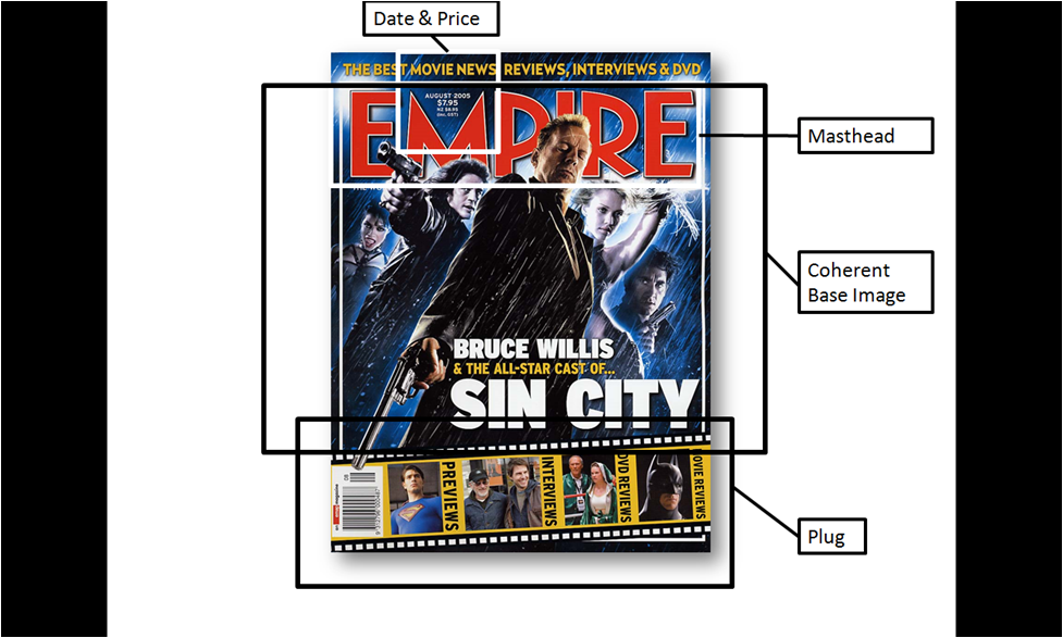
Also I saw the traditional conventions of an Empire Magazine, the logo (masthead) and the date and price in the letter M. As a result this has shown me that I have to also include these conventions in my Empire Magazine Cover to make it look professional and realistic.
Furthermore as all Empire Magazine Covers have plugs for my cover I have to make sure I have a plug, this cover has shown me a great idea that I can use for my magazine cover and therefore helped me when I create my ancillary text.

Firstly like the other magazine covers that I have seen I can clearly see the repetitive parts on the Empire Magazine, for instance the Empire website, barcode, teaser and plugs. As a result this has shown me some of the conventions that I have to include on the cover in order to make my Empire Cover look professional and coherent.
Furthermore I noticed how the usual + sign when the additional information is stated is twisted to an X. As a result as this is not usual this makes the Empire Cover look more colloquial which is what the Joker is all about. As a result this makes the cover coherent with the other aspects of the film and has shown me that I should try to use the conventions of the cover to my film genre and film.
This cover was the best Empire Magazine Cover I have seen from all of my extensive research.

From this magazine cover I can see that the masthead has not changed. As a result this has shown me that I cannot change the font of the Empire Logo as this will not look like a professional empire cover, however I do know that I can change the colour of the logo which will help me considerably to make my front cover coherent with my other ancillary texts and teaser trailer itself.
Also from this front cover I can see that the image is coherent with the other aspects of this film, this is because the image is of Wolverine, which is obviously the face of X-men. Therefore this has shown me that I have to make sure that my magazine is coherent with my teaser trailer and poster.

Furthermore from this Empire Magazine front cover this has reiterated to me the conventions of an Empire magazine, for instance I can clearly see that the masthead, strapline, Empire website, + sign, date and price and puffs & plugs are always extremely similar every issue. As a result this has shown me that the magazine cover that I create has to include all of these aspects because if it does not then this will result in my magazine not looking professional and realistic and therefore this will have a negative impact on my magazine as this will draw many people away, therefore I will make sure that I include all of these Empire magazine conventions.

The final Empire magazine that I looked at was for the film Expendables. This magazine cover showed me the importance of the base image. This is because this instantly entices the audience to look at the magazine over, which is the aim of the image and therefore this has shown me that I include a base image that is striking to the audience and therefore entices people to buy the magazine.
Furthermore this magazine cover, similar to the Sin City cover, includes a unique plug. This is because unlike the usual plug, just plain text, there is a comic strip template used that then includes the information. This is an excellent and effective addition and has enticed me to use the same template as I think that this will be extremely helpful and coherent with my Empire front cover as our film is similar to a Marvel comic.
In conclusion from this extensive research I have found out a lot of invaluable information which has helped me considerably to make an Empire Magazine Cover that looks professional, coherent and realistic.
Detailed research Amar with close analysis of existing Empire covers that will help with your own ancillary tasks, well done. Target: revise the magazine convention definitions - e.g. cover/sell lines have been referred to as plugs
ReplyDeleteChanges Made
ReplyDelete